


Products
- 18 PT Cards
-
32 PT Black Edge Cards

- Announcement Cards
- Bookmarks
- Brochures
-
Brown Kraft Cards
- Business Cards (14pt,16pt)
- Calendars
- Catalogs
- Counter Cards
- Door Hangers
- EDDM - Everydoor Direct Mail
- EDDM - FULL SERVICE
-
EndurACE - Waterproof
- Flyers / Sellsheets
-
Foil (Multi-Colored / Akuafoil)

- Foil Cards
-
Foil Cards (RAISED )
- Gift Card Holders
- Greeting Cards
- Hang Tags
- Letterheads / Envelopes
- Linen (Ecofriendly)
- Magnets
-
Natural Cards
-
Painted Edge Cards
-
Pearl Metallic Cards / Envelopes
- Plastic Cards - 20 PT
- Political Printing
- Postcards
- Presentation Folders
-
Raised Spot UV Cards
- Rip Cards/ Tear-off Cards
- Roll Labels
- Roll Labels (Custom Cut)
-
Silk Cards
- Stickers / Labels
-
Suede Cards
- Table Tents
- Trading Cards
Services
- DESIGN SERVICES
- BLOG
- Every Door Direct Mail
- Large Format Printing
- Sample Request
- File Review
- Custom Quote
- Wow Factor Effects
- FAQ
- Printing 101- Articles
- Testimonials
- About Us
- Contact Us
Track Your Order
Customer Login
FAQ
- WHAT IS CYMK?
- WHAT ARE HIGH RESOLUTION GRAPHICS?
- HOW SHOULD I MAKE BLACK?
- WHAT ARE BLEEDS?
- HOW DO I AVOID TEXT CUTOFF and WHAT IS SAFETY AREA?
- WHAT ARE THE PROBLEMS WITH BORDERS?
- WHAT IS NEEDED FOR MAKING SPOT UV?
- WHAT IS GANG RUN PRINTING?
- WHY DOES TYPE LOOK DIFFERENT?
- WHAT CAUSES BITMAPPING?
- CAN YOU MATCH COLORS TO OUR PRODUCTS?
- WHAT IS PLEASING COLOR?
- WHAT ARE PAPER WEIGHTS?
- HOW DO I MAKE SURE MY FILES ARE ORIENTED CORRECTLY?
- WHAT IS THE PROPER USE OF CROPMARKS?
- WHY USE A SPOT UV COATING TO ADD A WOW FACTOR TO YOUR PRINTING?
- CAN I USE PANTONE COLOR IN MY FILES?
- HOW CAN I MAKE SURE MY BLUES DO NOT COME OUT PURPLE?
- WHY ARE HIGH RESOLUTION PDF FILES ARE PREFERRED?
- HOW DO I GET A GRAYSCALE IMAGE IN A CYMK DOCUMENT?
- WHY DOES MY BUSINESS CARD CRACK AROUND EDGES?
- WHAT IS BANDING?
- WHY IS THERE CRACKING ON MY SCORING JOB?
- CAN I SUBMIT MULTIPLE FILES IN ONE DOCUMENT?
- HOW DO I USE THE FREE TEMPLATES?
- HOW DO I SET UP A SPOT AQ JOB?
- HOW SHOULD I SET A PLASTIC JOB?
- HOW DO I SET A FOIL GOLD, COPPER OR SILVER JOB?
- HOW DO I SET UP FOR ROUNDED CORNERS?
- WHAT YOU SHOULD KNOW ABOUT MULTI-PAGE BOOKLETS and CALENDARS?
- HOW DO I SET UP A AKUAFOIL CARD FILE?
- WHAT SHOULD I KNOW ABOUT EDDM?
- WHAT IS BUNDLING AND HOW DOES IT WORK?
- WHAT ROLL LABEL STOCKS ARE AVAILABLE?
RGB refers to the primary colors of light, Red, Green and Blue, that are used in monitors, television screens, digital cameras and scanners. CMYK refers to the primary colors of pigment: Cyan, Magenta, Yellow, and Black. These are the inks used on the press in "4-color process printing", commonly referred to as "full color printing". The combination of RGB light creates white, while the combination of CMYK inks creates black. Therefore, it is physically impossible for the printing press to exactly reproduce colors as we see them on our monitors. Many programs such as photoshop and illustrator have the capability to convert the layout/images from the RGB color space to the CMYK color space. We request that you convert your colors from RGB to CMYK if your tools allow you to. By doing it yourself, you have maximum control over the results.
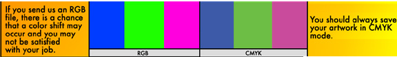
You may notice a shift in color when converting from RGB to CMYK. If you do not like the appearance in CMYK, we recommend that you make adjustments while working in CMYK. For more information, check out our Help Center PREPARING FILES-CYMK.
WHAT ARE HIGH-RESOLUTION GRAPHICS?
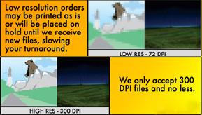
All files for printing need to be scanned or drawn at 300 dpi. What looks great on screen at 72 dpi would look pretty bad when printed. Increasing the resolution from 72 to 300 dpi in a paint program (such as Photoshop , Paint Shop Pro, etc.) does not work as this just interpolates the image ( i.e. adds pixels to the image), which in turn can increase the image size but makes for a more 'blurry' effect. For more information, check out our Help Center PREPARING FILES-RESOLUTION
We recommend that you use a CYMK black in order to create a RICH black. To do this, you need to use all the colors. Remember not all blacks are alike and if you want your black to stand out use this formula. For more information, check out our Help Center PREPARING FILES-MAKING BLACK.

If you want a background color or image to extend to the edge of the sheet so no white paper is showing you must extend the background or image past the trim edges of the layout. The part that extends past the trim edges is referred to as bleed. We prefer you extend the bleed edges 1/8 th or .125 past the trim. This allows for a small margin of error in the cutting tolerance and prevents a white thin edge showing around the paper.
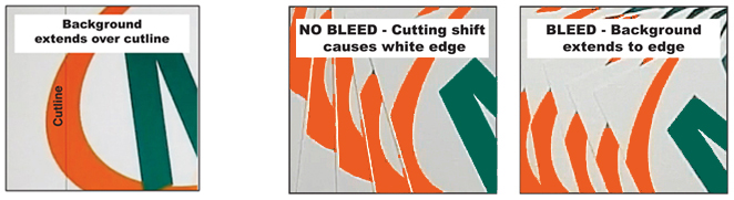
Bleed ensures that no unprinted edges occur in the final trimmed document.
If you use our FREE TEMPLATES, they will account for safety and bleed. For more information, check out our Help Center PREPARING FILES-BLEEDS.
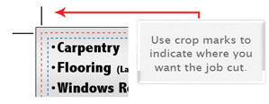
HOW DO I AVOID TEXT CUTOFF and WHAT IS SAFETY AREA?
To avoid text being cut off, be sure to keep all text inside safety to avoid text being cut off. Keep text inside safety zone.
Example shown will have text cut off.
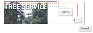
If you use our FREE TEMPLATES, they will account for safety and bleed. For more information, check out our Help Center PREPARING FILES-BLEEDS.
WHAT ARE THE PROBLEMS WITH BORDERS?
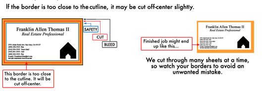
For more information, check out our Help Center PREPARING FILES-USING BORDERS.
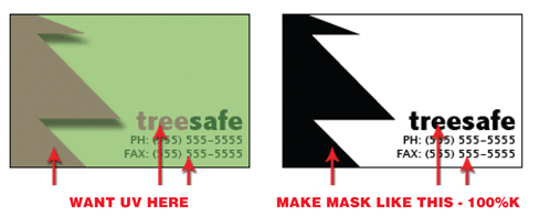
WHAT IS NEEDED FOR MAKING SPOT UV?
Spot UV is the option of having selected areas of your job high gloss UV coated and other areas of your job without UV coating. To set up files for spot UV , an additional file must be created for every spot UV side. This file must be black and white with the area to be UV- SOLID black 100% (no gradients) and the rest that will not be UVed must be white. For more information, check out our Help Center CREATING SPOT UV.
Gang run printing describes a method for printing multiple jobs on a standard size full sheet of paper,which is up to 28 X 40. This size sheet can accomodate thirty-two(32) 4" X 6" postcards or eight(8) 8.5" X 11 flyers and four(4) 11X17 4 page brochures printed on both sides. By ganging multiple jobs together, the costs of prepress, material and labor can be shared by all those participating in the run. In order to provide this inexpensive service printer must have a high volume of jobs to meet fast turn a round time. Due to this high volume we are able to provide our customers with choices quantity of paper weights and finishes but cannot alter those options on gang runs. If your specifications do not meet these requirements, we will quote your job as a custom printed job. But remember, a huge advantage of gang run printing is that they are the most economical way to print business cards, postcards, flyers, catalog sheets, brochures, and all small size jobs.
Many people are confused as to why something may look great onscreen but won't print without bitmapping. Basically, a standard computer monitor has a resolution of 72 dpi. Websites are designed at 72 dpi for this reason. For print we need 300 dpi that it why web graphics or any low-res file will give poor results when outputted on a hi-res postscript device. If the only image you have is at low resolution, then it will need to be redrawn or photographed at a higher resolution.
It is also best to steer clear of using the bold and italic buttons for boldening or italicizing your text. Say you are typing some body text in Times New Roman Regular. You then decide to bolden/italicize some words. If the file you are working on is going to be output from an imagesetter then this machine, when it comes across the first instance of the bold setting, will look for Times New Roman Bold on the system. In this case there should be no problem as the Times family of typefaces has a bold version and an italic version in place. A problem will arise where a single typeface has been selected such as Mistral. Normally, there is no bold equivalent on the system and the imagesetter would default to the plain version of Mistral. Of course, this doesn't affect what you see onscreen and what would print out to your deskjet/laser printer as these are designed to utilize all True-Type fonts. It's only a problem when trying to output to a high-resolution Postscript device. It is best to avoid any problems by using the correct typeface without using settings bold and italic.
CAN YOU MATCH COLORS TO OUR PRODUCTS?
Colors on your monitor or proofs from your printer will probably never match a sheet printed on a printing press. If you require critical color matching you must contact us prior to submitting your job and we can discuss the options available to you for critical color matching.
Pleasing Color is a term used by printers to describe the standard they use to evaluate the color quality of the printed sheet. It is a subjective evaluation. Different commercial printers make there own rules about pleasing color. At Color Printing Pros we have a very high standard for pleasing color. Our standard is that the colors be brilliantly bright within the limits of the process. That they are color natural, meaning they have no overall off color cast, they have good contrast with detail in both with highlight and shadow areas and they are clean and free from dust and artifacts. Keep in mind that if the file you submit is not created optimizing the color reproduction we cannot be expected to improve or correct your error. If you send files that are not created by a professional designer, you may want to take advantage of our FREE FILE REVIEW SERVICE.
The weight or thickness of paper stock is determined by the weight in pounds. of a ream (500 sheets) of the paper of a specified size. Points are measurement of the thickness of the paper. 1 point equals 1/1000 of an inch. The thickness of 10 pt. stock would equal 10/1000 or 0.010 in. many printers have their standard point stock as 12 point. Our standard stock is 14 point with a FREE option of upgrading to 16 point on most products. For more information, check out our Help Center STOCK OPTIONS
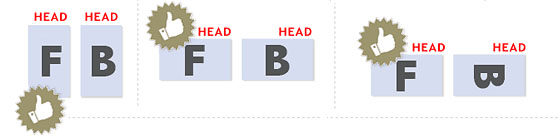
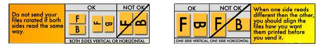
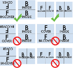
HOW DO I MAKE SURE MY FILES ARE ORIENTED CORRECTLY?
All files require proper rotation. Files submitted are printed HEAD to HEAD as-is based on your files. The HEAD is always the top of your file. Make sure to set up your files so when printed HEAD to HEAD the final product will read the way you would like. Also, front and back files need to be set up either vertically or horizontally. Files not properly set up will be the responsibility of designer.
If you have a fold-over or greeting card, please send your artwork as shown.
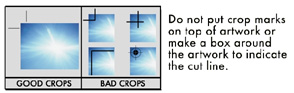
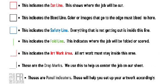
WHAT IS THE PROPER USE OF CROPMARKS?
Use cropmarks to indicate where you want the job cut.
WHY USE A SPOT UV COATING TO ADD A WOW FACTOR TO YOUR PRINTING?
As the name suggests, a Spot UV is applied to chosen areas of a printed card. This has the affect of highlighting and drawing attention to that part of the design, but it also provides the additional visual stimulus of having varied textures on a single printed surface. The Spot UV technique is achieved by applying a UV gloss spot varnish on top of clay coated paper. This achieves maximum contrast between the highly reflective shiny UV coating and the more light-absorbing clay coated finish, which creates a striking first impression. To set up files for spot UV,
an additional file (mask) must be created for every spot UV side. This mask must be black and white with the area to be UV- SOLID black 100% (no gradients) and the rest which will not have spot UV must be white. Send your grey scale mask file with your CYMK file. Spot UV can add a lot of interest, and can identify the printing as a premium piece of sales and marketing literature in the perception of the reader.
CAN I USE PANTONE COLOR IN MY FILES?
Pantone colors can affect your order since a color conversion is made between a Pantone color and CMYK. If you use Pantone colors in a job that will print CMYK, your job might print with undesirable colors.
Here are some examples of what the Pantone color looks like in the Pantone color book and what the CMYK print will look like:
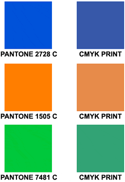
If you send in a job with Pantone colors, the CMYK conversion will change the Pantone color. Before sending your order, make sure all Pantone colors have been converted to CMYK.
HOW CAN I MAKE SURE MY BLUES DO NOT COME OUT PURPLE?
When using a blue in your design, always make sure to leave at least a 30% difference in your Cyan and Magenta values. Blue is close to purple in the CMYK spectrum. Remember, use a low amount of magenta whenever using high amounts of cyan to avoid purple. Example: C-100 M-70 Y-0 K-0
Here is: C-100% M-100% Y-0% K-0%
On Screen
![]()
After Printing
![]()
WHY ARE HIGH RESOLUTION PDF FILES ARE PREFERRED?
Before you create a PDF from Photoshop, make sure your color mode is CMYK, your resolution is 300 dpi and your layers are flattened.
* They are a "locked" file format, which can eliminate file variations due to platform, software or version issues.
* They are a compressed file format, which means smaller files and faster upload times.
* They are a single file format, which makes for faster and easier uploads (no need to upload fonts or links separately).
A PDF helps to insure that your job proceeds quickly, smoothly and with no unexpected "surprises."
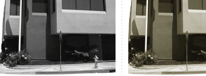
HOW DO I GET A GRAYSCALE IMAGE IN A CYMK DOCUMENT?
Grayscale images that are converted to CMYK will have a color shift in the final print. That shift may be green or yellow. Always check the CMYK values of your grayscale in the final CMYK document. If there are other values other then K in your grayscale image, there is a chance that the color will vary.
To eliminate all values other then K, use your Channel Mixer (adjustment layer) in Photoshop, then click "Monochrome" and adjust accordingly.
Grayscale On Screen........................Grayscale After Print
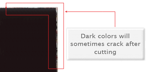
WHY DOES MY BUSINESS CARD CRACK AROUND EDGES?
Cracking of the edges of a business card sometimes occurs when the card contains high values of ink, as in dark colors. This usually happens on a small amount of cards in the run. To prevent this, use lighter colors or if you must use dark colors, use as little ink as possible.
Close up of business card
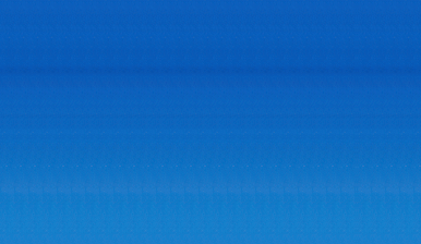
Many things can cause banding. Banding can be caused by the program that it is exported from, such as Indesign or Corel. Also, too many gradient steps, for example going from a very light color to a dark color, in a small area will cause banding. To prevent this, check your digital files before sending. If you use a gradient, make sure it has enough room for a smooth transition.
Close up of banding
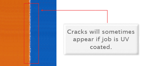
WHY IS THERE CRACKING ON MY SCORING JOB?
When a job is coated with UV then scored and folded the job may begin to crack. During use, the cracks will become bigger and the ink may start to chip off. Cracking is normal when coated jobs are scored and folded. The only way to prevent this is to order the job without UV.
Close Up Scoring
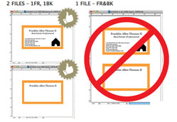
CAN I SUBMIT MULTIPLE FILES IN ONE DOCUMENT?
NO. We are set up to process one side at a time and this requires that each side of a job must be a separate file. Not separating files will cause delays and you might have to send files again. Remember to separate pages of your pdf files as well.
Our FREE Templates are a great tool to create artwork that can be printed faster, easier, and more accurately. Download the JPG version given for selected product.
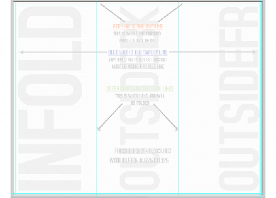
These templates will help you identify where the cut line, bleed line, and safety line, are located along with other information so you can design your art correctly. Some of our templates are labeled as OUT and IN. This means that there is some folding involved with the template. Remember that OUT is the FRONT and IN is the BACK.
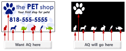
HOW DO I SET UP A SPOT AQ JOB?
When creating a Spot AQ job, you must include a Spot AQ template along with the regular full color file. The Spot AQ template file is used to show where the AQ will be placed. Use white, 0C 0M 0Y 0K, to indicate where you would like the AQ. Black, 100%K, will indicate no AQ.
HOW SHOULD I SET UP A PLASTIC CARD JOB?
When designing plastic cards, it is important to keep in mind that the frosted and clear plastic cards are transparent. Also, all plastic cards come with round corners at no extra charge!
As you can see, the difference in the transparency is shown in the image above. The clear cards (right) are completely transparent. The frosted cards (center) are semi-transparent and cannot be seen through easily. The opaque white plastic cards (left) are solid white and not transparent at all. Keep this in mind when designing your plastic cards, it will affect how your design will print.
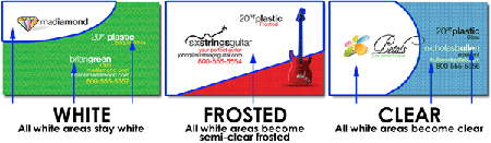
Since there is no white ink in CMYK, it is important to keep in mind that the frosted and clear plastic cards are transparent. The three designs above are the same as in the first picture. You will notice that the white area in the clear cards (right) and the frosted cards (center) has no ink and will show the transparent material it's printed on. In this case, the clear cards and frosted cards white area show up with no ink on the printed piece. Also, keep in mind that all colors that are printed on clear cards or frosted cards will be transparent as well.
With the clear plastic cards, there might be a small percentage that may have light scratches. This issue originates from the manufacturer and is due to the material and handling. To help compensate for this, we run overs of the clear plastic cards to help meet the required quantity. For more information, check out our Help Center CREATING PLASTIC CARDS
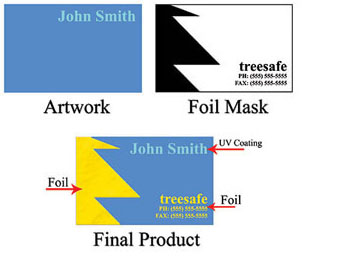
HOW DO I SET UP A GOLD, COPPER OR SILVER FOIL JOB?
We offer 3 types of foil, Silver, Copper and Gold. Each order can only have one type of foil, Gold, Copper or Silver. You CAN NOT order a Foil job with Gold foil on the front and Silver foil on the back.
Foil mask files are set up just like our Spot UV mask files. The file can only be black and white. Black in the areas you want the foil and white in the areas you do not want the foil.
Please see images below to see what files should look like to achieve final product.
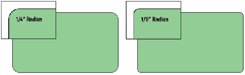
HOW DO I SET UP FOR ROUNDED CORNERS?
We offer 1/4" standard on our rounded corners. BUT 1/8" radius round corners are available to all of our customers. The image below shows the two different radiuses for comparison.
Be sure to account for this in your text cutline and safety area.
WHAT YOU SHOULD KNOW ABOUT MULTI-PAGE BOOKLETS and CALENDARS?
Booklets range from 4 to 32 pages, calendars range from 24 to 28 pages. Both are printed on durable 100lb Book stock and are assembled in-house. To ensure the pagination is correct, the pages should be provided as single pages, not as spreads. As a standard, all elements, text and images that are not intended to bleed off need to be at least 0.25" from the cut line for safety. Artwork should be provided with at least 0.25" bleed around. We highly recommend to use our booklet templates when creating your artwork.
HOW DO I SET UP A AKUAFOIL FILE?
For an AKUAFOIL card, you must include a foil mask file along with your CMYK file. The mask file indicates where the foil will be placed. The file process is the same as spot UV. A GRAYSCALE file with 100% K where foil is placed, 0% where the foil is not placed is sent.
When creating knockouts in your foil mask or in the CMYK print file, beware there might be a "Halo" of white around the knockout area. Below are two examples... On the left, a file with a CMYK magenta background with a knockout for the “Every Color™ foil” text. On the right, a foil background with a knockout for the CMYK text.
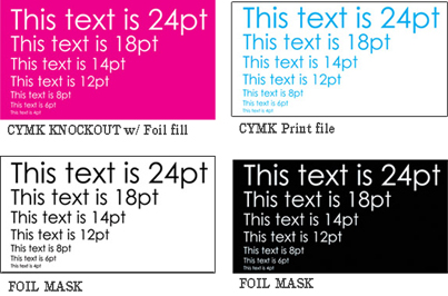
These are the printed results:
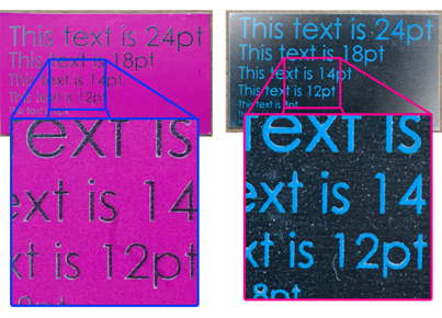
You can see the white "Halo" in-between the CMYK ink and the colored foil. To prevent this, grow/stroke the foil area in the mask by 1–2 pixels. This will allow the foil to bleed into the CMYK area, reducing the white "Halo" effect. You can also fill in the knockout with a color to reduce the effect further.For more information, check out our Help Center CREATING AKUAFOIL CARDS
WHAT SHOULD I KNOW ABOUT EDDM?
With Every Door Direct Mail (EDDM) is an easy, cost effective way to deliver your message to every door. Color Printing Pros makes it easy by offering the sizes and stocks that fit into the EDDM restrictions.
- Use the USPS online tool to target areas you want to reach with your mailing — choose routes by neighborhood, ZIP Code, or city.
- Get your mailing to every mailbox along the chosen routes — delivered by USPS Letter Carriers with the day's mail.
- Spend as little as 18.3 cents per piece on postage.
NOTE: For all EDDM products, you are responsible for setup and delivery to USPS for EDDM processing. CPP will use our standard bulk packaging to process your order. No additional or specific handling is available. USPS requirements for EDDM include choosing the area for mailing from the USPS system, bundling the postcards in packs of 50 and labeling each bundle for the preselected route. CPP will not be responsible for these requirements.
For more information on how EDDM works, please visit https://eddm.usps.com/eddm/
WHAT IS BUNDLING AND HOW DOES IT WORK?
Bundling offers the convenience of sorting print orders into predetermined quantities for ease of use by you, your customers or for EDDM purposes. Orders will be bundled in quantities of either 50 or 100 pieces and they will be banded in accordance with USPS EDDM banding requirements. Please note that the type of band we use may vary subject to availability. (Paper band is shown below)

WHAT ROLL LABEL STOCKS ARE AVAILABLE?
Stocks available are:
- White BOPP: 2.3mil thickness- BOPP (Biaxially Oriented Polypropylene)
White BOPP is made of Glossy White Polypropylene with a permanent adhesive that sticks well to a variety of surfaces. White BOPP is oil and water resistant but we only recommend it for indoor use. - Clear BOPP: 2.3mil thickness- BOPP (Biaxially Oriented Polypropylene)
Clear BOPP is made of Glossy Clear Polypropylene with a permanent adhesive that sticks well to a variety of surfaces. BOPP is oil and water resistant but we only recommend it for indoor use. We offer white ink as a 5th color on these. Please see our FAQ section for details on how to set up your order prior to uploading. - Semi-Gloss Roll Labels: 60lb weight
Semi-Gloss Paper is a more budget friendly solution without sacrificing on quality. Semi-Gloss Paper stock has a permanent adhesive that sticks well to a variety of surfaces. It is not resistant to oil or water and is for indoor use only. - Bright Metallic Silver Roll Labels: 2mil thickness
Bright Metallic Silver Roll Label comes standard in a 2mil thickness. Offering excellent tear strength and opacity, these mirror-like labels are heat and chemical resistant so they're suitable for application on a variety of surfaces.
NOTE: There’s no option for square corners on any of our Roll Labels. All square and rectangle shapes come standard with 1/8 inch rounded corners. Bleed is different for Roll Labels than for our normal stickers. Please download the appropriate template for your order.
Copyright Catalog Graphics/Color Printing Pros 2016